v11
The v11 was an opportunity to put our best technology on the v10 chassis and for us it was a chance to raise the bar for the user interface and user experience of our cord free machines. We knew that users were frustrated not knowing when the machine was about to run out of battery power, in terms of actual time left. The only choice was to quickly glance down at the segmented battery indicator. Ultimately, users wanted to know how much ‘run-time’ they had remaining, based upon the ‘clean mode’ selected, the tool that was attached and the surface they were cleaning; the power required and therefore available from a battery can alter significantly between cleaning a rug, compared to that for a smooth wooden floor, for example.

The Challenge
There was a long list of challenges on this project, but here are just a few of them: • How might we calculate the battery runtime? • How might we show ‘rich’ maintenance guidance and mode guidance to the user? • How might we avoid the runtime from ‘jumping’ as the user vacuums? • How might we show feedback with or without language? • When is the best time of surfacing the different elements of information and how might the user interact with the user interface?


Fortunately, two other ‘experience designers’ in the Design and Product Experience team had recently been through a similar project of integrating a 128x128 TFT LCD, into the new Dyson Purifier. This had been a major advance in UI and UX for Dyson. By harnessing the onboard Air Quality (AQ) sensors, the purifier could provide live feedback of the AQ with a live graph on the TFT LCD. This made it super clear when the purifier ‘ramped up’ in Auto mode and users engaged with this intelligence.
After gathering all the user needs from previous floor care trials, we managed to agree on a top-level feature list with key stakeholders. The battery runtime was the hero feature and it was based upon how they used the V11. Somewhat similar to a fuel gauge in a car; the faster, or heavier a vehicle might be, the more power it must consume, affecting either the range or time available performance. We wanted to show minutes and seconds so the user got a sense that the runtime was reactive and intelligennt. For even with a fully charged battery vacuuming the worst use case i.e. only and constantly cleaning a deep pile carpet with the cleaner head, a battery will only last a matter of 30+ minutes in Auto/Med mode; whereas cleaning on a smooth tiled floor constantly, the battery will last 40+ minutes, for example. The research team wasted no time and started to simulate a runtime algorithm that could sit on top of the pre-existing state of charge algorithm.

Working alongside the design engineers from the floor care team, we managed to ‘borrow’ some 128x128 TFT LCD screens from the environmental category and started to integrate a screen into a v10 cord free vacuum cleaner. After collaborating with the electronics team, we managed to connect the motor power comms to a ‘raspberry pie’.
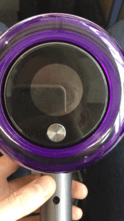
The motors and powers systems team tend to lock down the layout much earlier than the rest of the product functions as they have to undertake the battery approvals. Hence, we had to define the screen hardware spec and it’s position early on into the project. We finally narrowed it down to two positions, the first being on top of the cyclone pack (slightly angled) and the second was on the back of the motor bucket. In that second position, there was limited space for more than two buttons and the screen felt hidden when it was placed on the wall dock. However, it just made sense when the machine was being used in the ‘stick format’ shown below with the user pressing the button. Plus it helped with the viewing angles that came with the LCD TFT.

The IP team were also confident that we could get a patent by attaching the screen onto the motor bucket which was linked to the motor PCB.

The additional UI wake up power line from the BMS to the motor PCB was another massive win, as we knew users wanted to interact with the screen when the vac wasn’t running. The scenarios became endless, such as mode change, watching maintenance guidance animations, selecting a language (and into the future, changing settings on the machine).
Once we had the raspberry pie screen rig up and running with the Crank software, we were able to upload concept screen assets and behaviours and iterate new options every two weeks. Whilst we were still debating flash memory for the UI, we found users found it more useful to watch an animated video for the maintenance guidance steps (e.g. Airways blocked, then play animation showing where a blockage might have occurred). One of the biggest challenges on the whole project was finalising the UI graphics for the home/running screen as there were so many factors that affected the run time, such as: state of charge, power mode selected, tool attached to the machine, what they were cleaning and how they used the machine.


During the project, the motor bucket had to made smaller to provide more space for acoustic silencing and filter media. As a result, we were left space for one mode button and this had a big impact on our information architecture. Selecting the language with one button was always going to be an ugly user experience (i.e. tap to scroll in one direction and hold to select).
As the list of alerts started to increase, we specified an alert hierarchy to avoid information overload for the user. We also divided them into hard and soft alerts; (soft alert was an event that could be dismissed, i.e. a filter wash reminder and a hard alert was an event that had to be diagnosed before the clean could continue.)
Once we had approval to undertake external user trials in the UK and US, we had the chance to fully test our UI/UX prototype.
We have two objectives:
1. Gauge consumer understanding and appeal of screen offering
2. Examine the perceptibility, understanding and desire for DLS+ technology inside the Torque cleaner head
After doing these trials, one after the other we gathered a lot of valuable insights we had anticipated. However, we didn’t expect how many users really appreciated the value of the screen, when they switched back to a machine without it.

The creative UI team produced over twenty different home screen options. However, the final version produced presents a ‘three battery’ UI. The three battery UI option was selected as senior stakeholders felt it clearly indicated how the three different modes would affect the battery/runtime. It felt strange putting three batteries on the home/running screen and many users thought the larger ‘bar’ for ‘Eco’ meant more power, but after pulling the trigger, they realised it meant more runtime.

Through out the user trials we faked the runtime algorithm by using a Bluetooth keyboard as the runtime algorithm was still in development. This also allowed us to send commands for the maintenance alerts and charging behaviours etc. The runtime feedback on the screen proved to be hit with participants in the user trials, so there was still a lot of pressure on research and the battery engineering teams to validate the runtime algorithm on production v11 battery packs, in real life situations. There was a concern the runtime would constantly jump up or down as the battery data was being captured every 250ms. As a result, they created a smoothing algorithm that updated the runtime if it crossed the threshold for a period of time. The downstream engineering teams validated the feature in the Singapore/Malaysia test facilities to ensure it was acceptable for launch.


In the later stages of the project, post trials, there was a direction to also design a low-cost UI SKU and we felt this was a step in the wrong direction at the time, but at least it was still an improvement on the v10 UI. Ultimately this allowed commercial to understand how many US users were willing to pay extra for the TFT LCD screen.

V11 was the first Dyson project with language integrated on the screen and users were able to understand the mode labels in their own language as ‘Boost’ was not universally understood in different countries. This was one of the best decisions we made (but we didn’t realise the pain that would come with the translation process and making sure the line breaks were correct on the 128x128 TFT LCD with the circular mask).

The screen was a success on v11 and we have continued to improve the UX on the next generation machines such as the Dyson Slim and the Outsize machines. The first update included a new language selection behaviour. After trying multiple animations to ask the user to hold the mode button below the screen to select, we decided a scrolling ticker tape text animation worked the best. We also made sure that Arabic was animated in the opposite direction.

The Alerts feature has also been a success on new machines as the vac motor momentarily pulses to get the attention of the user when the user needs to look at the screen. We felt it was important to prompt the user when the machine is running low as it gives the user time to click down a power mode if they have more vacuuming to do.
